
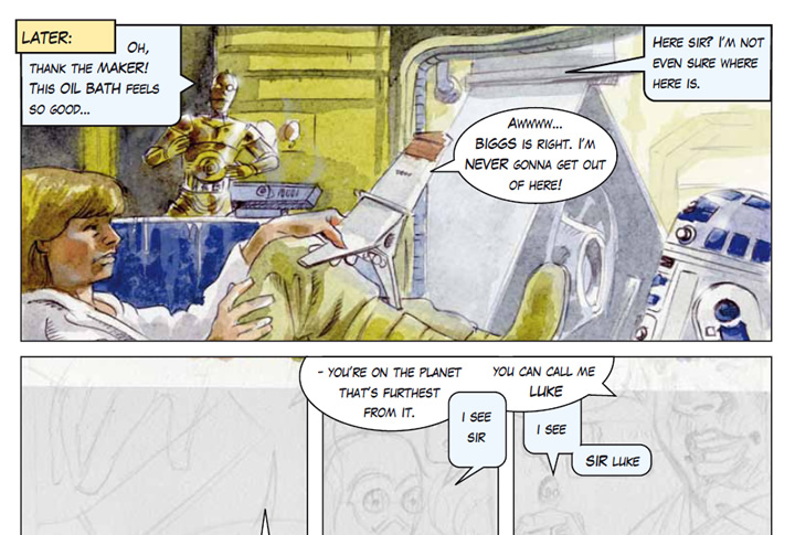
038: “Thank the maker!”
The first ever 2010 SWA9 comic page art
Here it is! It was inevitable really. When I first started publishing the comic online even my wife suggested that I do some new pages. No, they wouldn’t amuse the site’s readership, but I justify it thusly:
A.) Some parts of the adaptation were lost, omitted or just skipped over – leaving holes in the story.
B.) It’d be an interesting exercise to try out some comic creation for the first time in – literally – decades. To see if I can actually do it.
C.) It’d be a lot of fun! – for me.
Art Notes
How to Get Started?
So finally, lifting my pencil with trepidation, I wondered: how? Making comics when you’re a child is so easy, but when you’re 42, with heightened critical faculties it’s daunting – and hard work. This page, done at the age of 9 – in biro – probably would have taken half an hour. But for me, now, it’s probably taken at least 24-32 hours’ work on and off. So hardly the basis for a viable career yet! (I’m faster now in 2015! John)
Trial and Error, learning the hard way
Being a bit old fashioned – like Bjorn Borg and his ill-fated wooden racket professional comeback attempt – I attempted to create the page on watercolour paper, with pencil, gouache, Polychromo colouring pencils and pens. It was a flop. I used this approach in the 90’s for B&W newspaper illustration, and added studio markers for brilliant colour in glossy magazines. Anyway, it was awful and much too difficult to make corrections to.
Murky and expressive – sure, but not too good for shiny space-detail!
So I faced the facts: it must be done on the computer.
Inking – sort of…
My compromise was to ‘ink’ it in pencil – reasonably neatly and scan it in. Then I had to find out how to isolate that line work, darken and even colour the lines themselves. This was a very interesting process. I found this article on the excellent ReMind Graphic Novel blog very useful from the point of view of using pencil and making it look like ink – skipping the inking stage. Besides, I don’t feel confident or skilful enough yet to actually ‘ink’ on the computer, even with a graphics tablet.
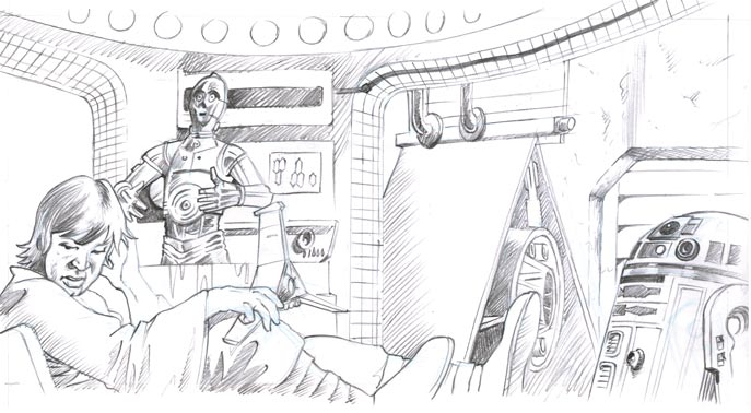
Dammit – why does the pencil version always have to look so good?
My friend Shane Whelan was a great help here. He went to the effort of typing a lengthytutorial for me, describing how to isolate my pencil lines – and colour them. So that was thatsorted. Thanks again Shane.
‘Flatting.’ Eh?
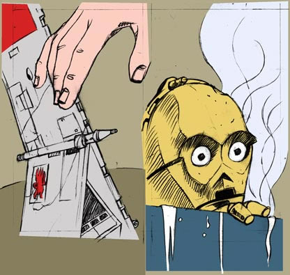
This, I discovered is the sort ofcomics equivalent of the old animation industry’s brain-numbing cell-painting process. The sort of labour that a male-dominated industry would give to the girls, whilst the boysdazzled all with their animation prowess. So, I was grateful to the aforementioned ReMindBlog and also to Lisa of Just Flats for her video tutorials. I’d had absolutely no idea what flatting was, or what it was for. The first time I ever heard of it was from Rod Hannah at Blue Milk Special, when he too was kind enough to type out a lengthy explanation of their production process. I see now why many artists sub-contract this work. Flatting isolates the main blocks of colour so they can be easily selected for further work. Successful artists hire Flatters to do this for them.
Colouring
Then I felt my way along, in Photoshop, trying to mimic the colours and tones of the film as well as I could from YouTube clips. I’m sort of happy with the results. I say sort of, because on the one hand it looks pretty good but on the other I think I’ve got much learn about Photoshop’s brushes, and how to work faster. Practice, practice, practice…
Planning and Text
I’ve put this at the end – even though it’s the most important part! I actually did do my best to plan this page and the others that will follow, but I soon realised, having never done this before that you also have to plan where the type is going to go. To do that, you have make editorial decisions “how much text should there be?”
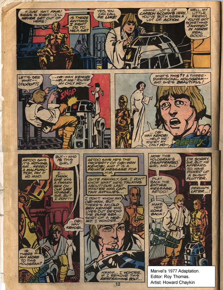
Roy Thomas & Howard Chaykin’s amazing compression of the scene 1977.
I looked back at the Marvel adaptation and did indeedmarvel at how they fitted the whole workshop scene into 1 single page! Editor Roy Thomas was doing his job excellently. Mine would take at least 4 pages! Being experienced comic producers they’re comfortable with the idea of slashing text and putting more emphasis on the visuals to tell the story. I on the other hand have no proper experience. And what experience I did gain as a child – I’ve completely forgotten. It’s funny, as a child it was easy for me to cherry pick and omit large swathes of text. There’s obviously something to be learned from an experienced mature editor like Roy Thomas – and from the gut instincts of a 9 year old.
The Verdict
Over all, I’m proud of what I’ve done on this – my first evergrown-up comic page – even if I didn’t catch a good likeness of Luke. I understand now why comic production can be something of an assembly-line, involving many experienced and talented people.
But, I can also see that I used a few tricks that I wouldn’t really tolerate in others. One has to be honest. For example,Photoshop effects.
Tricks
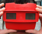
One trick is that of creating an illusion of depth, not with the pen and colour, as a proper artist would, but with a blur filter. It’s lazy and ridiculous really. The far background in the top panel does recede visually but it then makes Artoo – who was drawn and coloured quickly and quite well – look flat! The opposite of what was intended. Did you ever use one of those Stereoscopes when you were young? The illusion of depth was wonderful, but each layer itself was flat. Chaykin‘s freely inked, flat coloured artwork still has depth. Without any digital trickery. This is a drawn medium – electronic/digital effects look out of place and a bit tacky.
The other thing I really don’t like is the smooth gradient fill. You can see it on the steam in panels 3 and 4. If it was painted-in loosely it’d be fine, but I haven’t the skills for that yet. (in 2010) It’s out of kilter with the pencil line-work and colouring.
I’ve tried to avoid airbrushy effects as much as possible – because I hate that anally-retentive-have-to-make-it-look-like-a-photograph style. I did put a few glows here and there though, especially in Threepio. My only, somewhat feeble defence is that Lucas himself used a gauze when he shot Star Wars to lend it a fantasy quality.
And… I didn’t use any lens flares!
So, some lessons learnt for the next ones! Do please leave your opinions top-right?
That’s AWESOME, John! You did an outstanding job on this page! I followed its process via your posts on Facebook and I could see it was going to be awesome just from the first couple of panels. I also really like your lettering. Top notch. If it was done in illustrator then you coudl manipulate and shape the balloons to fit the text better, but looks like you used the same technique I use for Blue Milk Special which is to just work with ellipses in photoshop. It still looks great when used competently, and by someone who has an eye for what looks good and what doesn’t. You sir, have the eye! Love Luke’s expressions and the lighting on Threepio. The blur effect on the T-16 was a masterstroke!
Thanks Rod! Much appreciated. But, ahem… do you know, I actually DID lay it all out and did the balloons in Illustrator? Looks like I need to work on it :-* I’m learning more and more about Photoshop and Illustrator and hopefully will get snapping and alignment figured out.
I would have used InDesign for layout and text but the vector tools are too limited for drawing bubbles. The lettering isn’t by hand I’m afraid. I just downloaded a ‘free’ font. ‘Upper-case’ gives a slightly larger, bolder and more oblique version of the characters. Not very versatile. What font do you use? I’m even undecided about the font I used here – a bit cartoony.
I think it looks great Hon. More power to your elbow.
Thanks Gabby
Hi John, I think the whole thing looks very impressive. I really like the glow effects and as you say, like the glowy quality of the film, it does give it a fantasy atmosphere. Well done and I can’t wait to see some more!
Gosh – maybe I judged my ‘glows’ too harshly! Thanks Candace.
Question is, when will I get the time to do more? 😮 I suppose I’ll be quicker next time though.
This is great, John.
I’ll admit, I am rather partial to the colored 3PO in your ‘flop’ – but this page looks spiffy.
As someone else who paints in layers in PS I am well aware of the trials and tribulations of getting what’s in your head onto the page – but this page has a lovely quality to it – kudos!
Cheers Neil.I apreciate it. What do think: Colored lines – or black lines?
Quoting John I. White:
“Cheers Neil.I apreciate it. What do think: Colored lines – or black lines?”
I’m partial to the black lines, myself.
Yeah, it’s a tricky one. The coloured lines are more subtle, more realistic, but they lessen the impact of the images to a degree. When I look at that rough, inset ‘flatting’ image of Threepio above which has rough black line and totally flat colour – it has certain merits. More energy I think.
Hi John
Looks like you’re having a lot of fun doing this, looks great, it’s got ‘labour of love’ written all over it.
Thank you Maurice. Yep, remember our discussion? It’s ok – even good – to spend some time doing what you enjoy – no matter how nerdy it might ‘appear’. I’m learning a lot from this.
Any advice? You know I still haven’t found that weird 2 page comic I did, about all of us in the flat in college. I hope it shows up.
Impressive… most impressive.
Thanks Sam. Check out the next page.
John
Okay, so maybe I’ve just gotten too used to digital painting and all the tricks that such artists use, but I didn’t even notice the gradient in panels 3 and 4…
I would also like to say that the colored pencil version is amazing and beautiful! I don’t know where you got the impression that it was a ‘flop’, as you didn’t explain in too much detail, but I have to disagree.
Both versions are great, though^^ And, I think that if you had used traditional media, it would have felt better (even with some mistakes) with the rest of the comic.
Thanks Aelfrey,
Glad you’re enjoying the comic – even these pages from ages ago.
I dunno, I thought traditional media would be nice and loose and expressive but it ended up a bit messy looking. Perhaps I just needed better paper: somethng with a bit of ‘tooth’ to it, rather than cottony soft watercolour paper.
Ah, but the whole comic is “messy-looking” ! Heheh. That’s part of its charm^^
Uh, I tried posting this already, so maybe this will end up being a duplicate, but I don’t see it….ah well!
The whole comic is a bit “messy-looking” ! That’s part of its charm^^
And part of why more traditional pieces would probably look more in-sync with the rest of it!
True enough. I wasn’t really trying to fit in though, The whole thing is a patchwork.